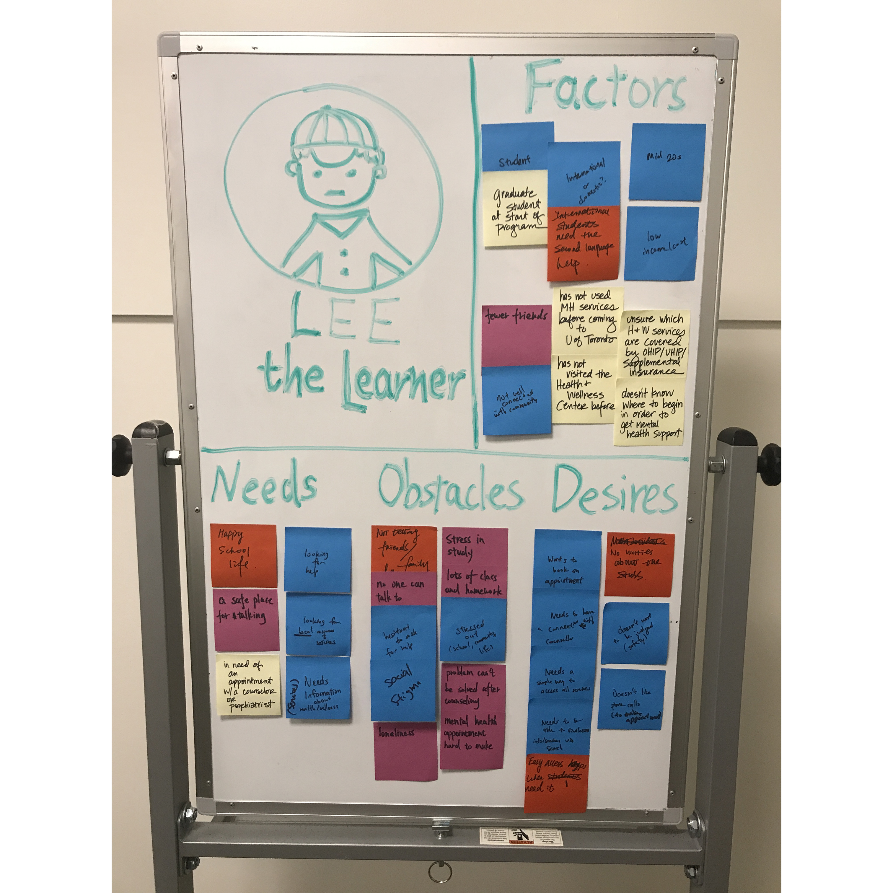
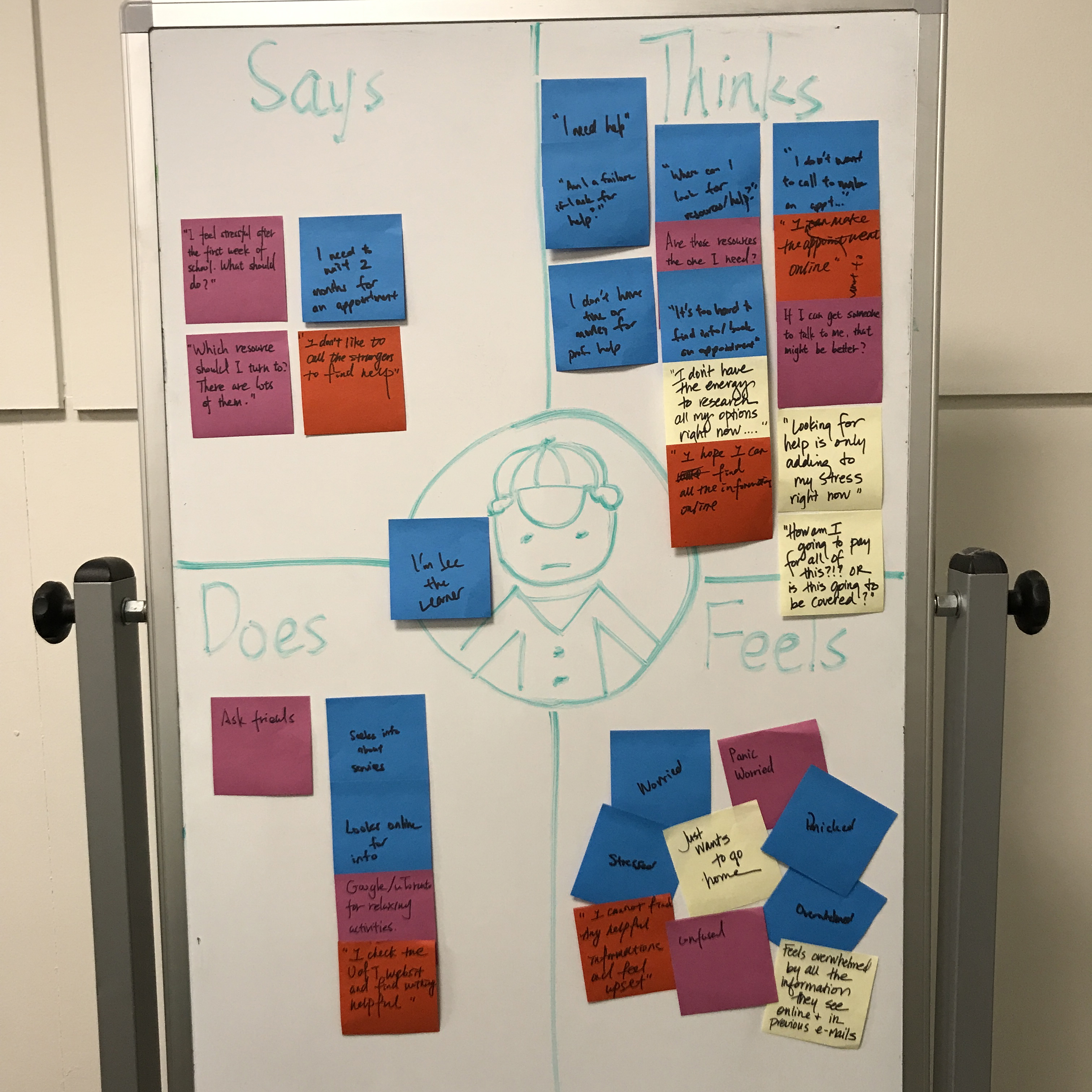
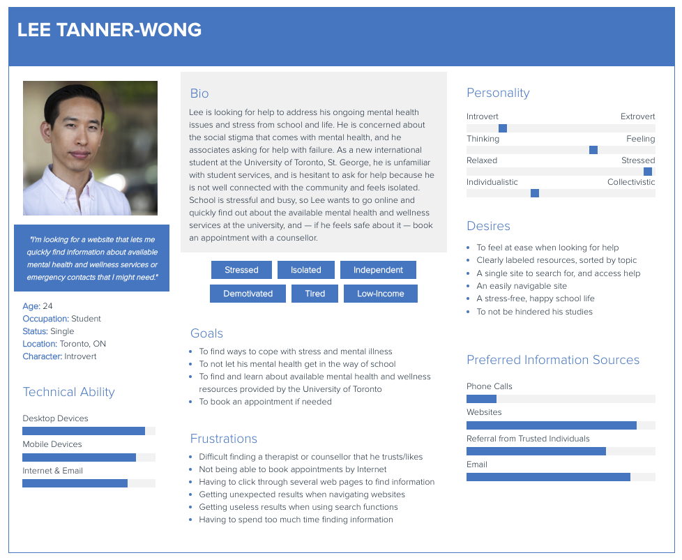
Telempathy is a personalized mental health care navigator developed as part of the Fundamentals of UX Course (INF1602) at the University of Toronto. This course introduced me to the UX design-thinking processes, and the terminology used in this field. In collaboration with the Innovation Hub at the University of Toronto, I worked with three other students to design a project that began with identifying and examining a problem space at the University of Toronto, to developing a medium-fidelity prototype of an app.
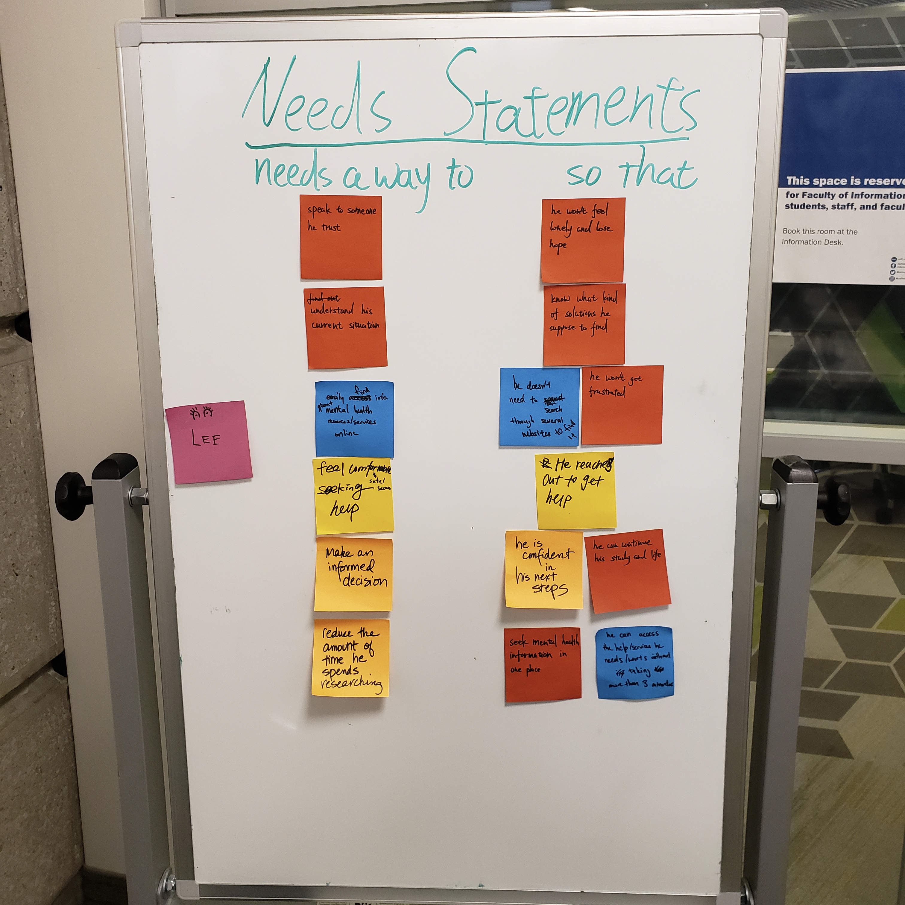
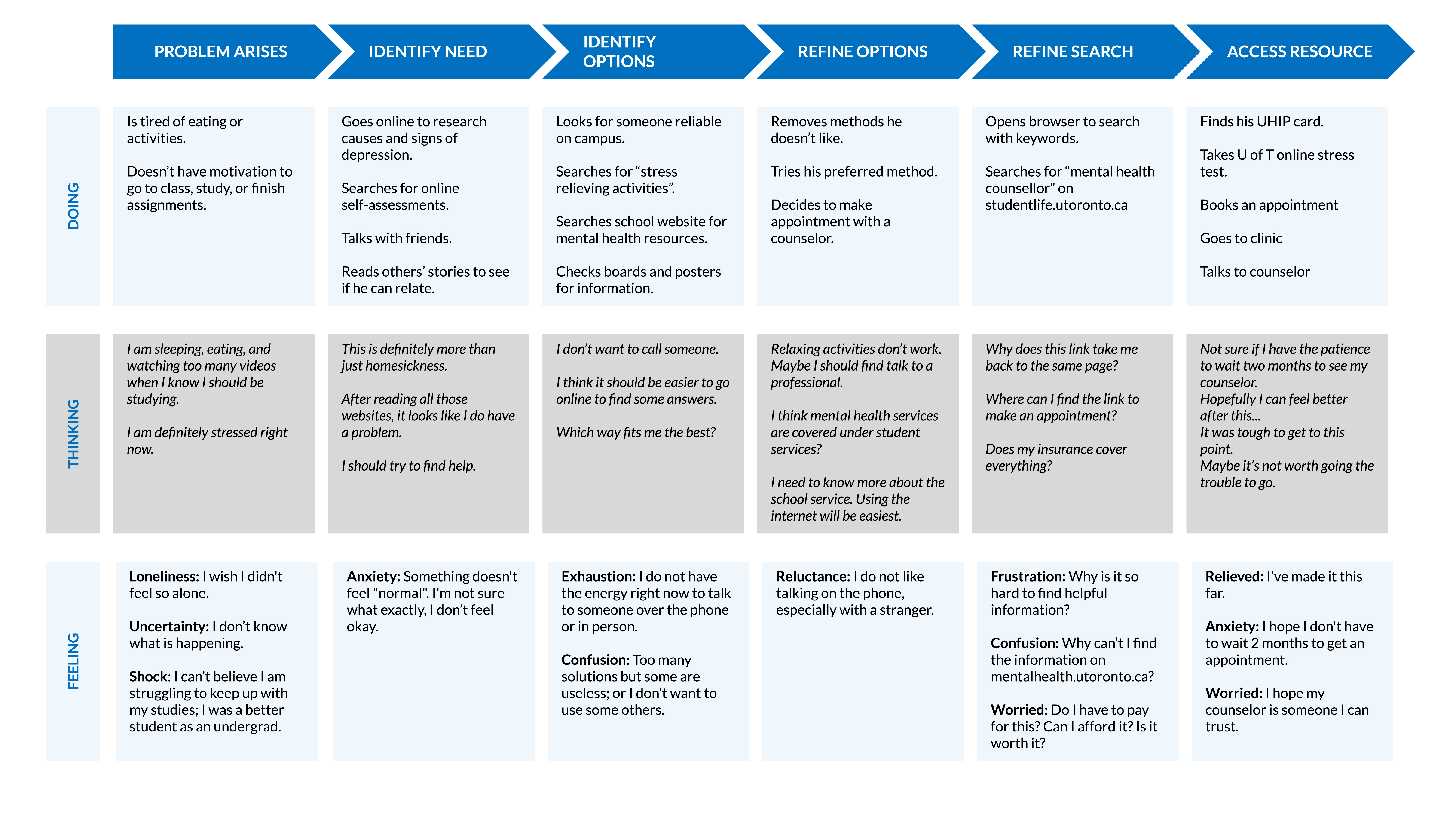
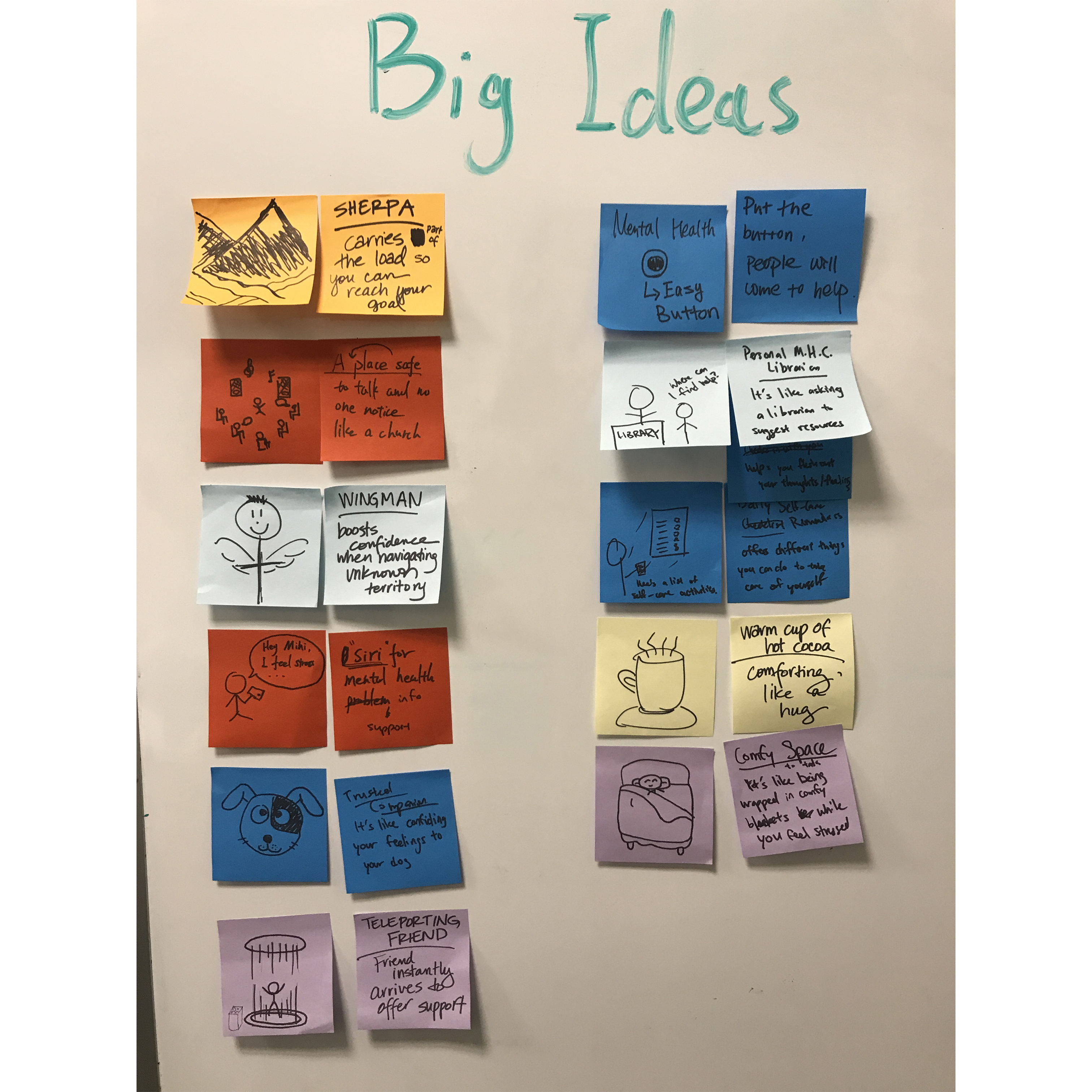
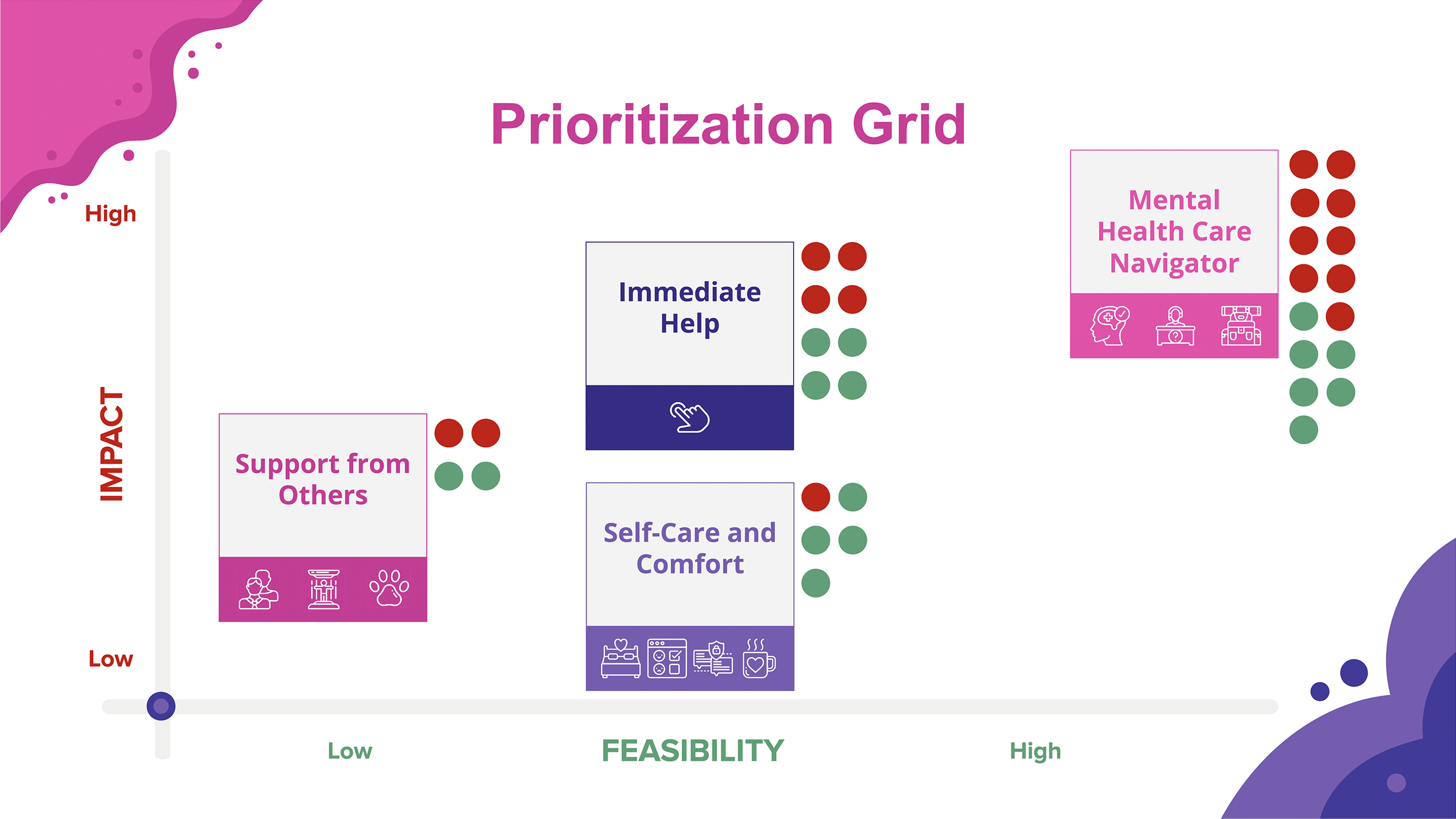
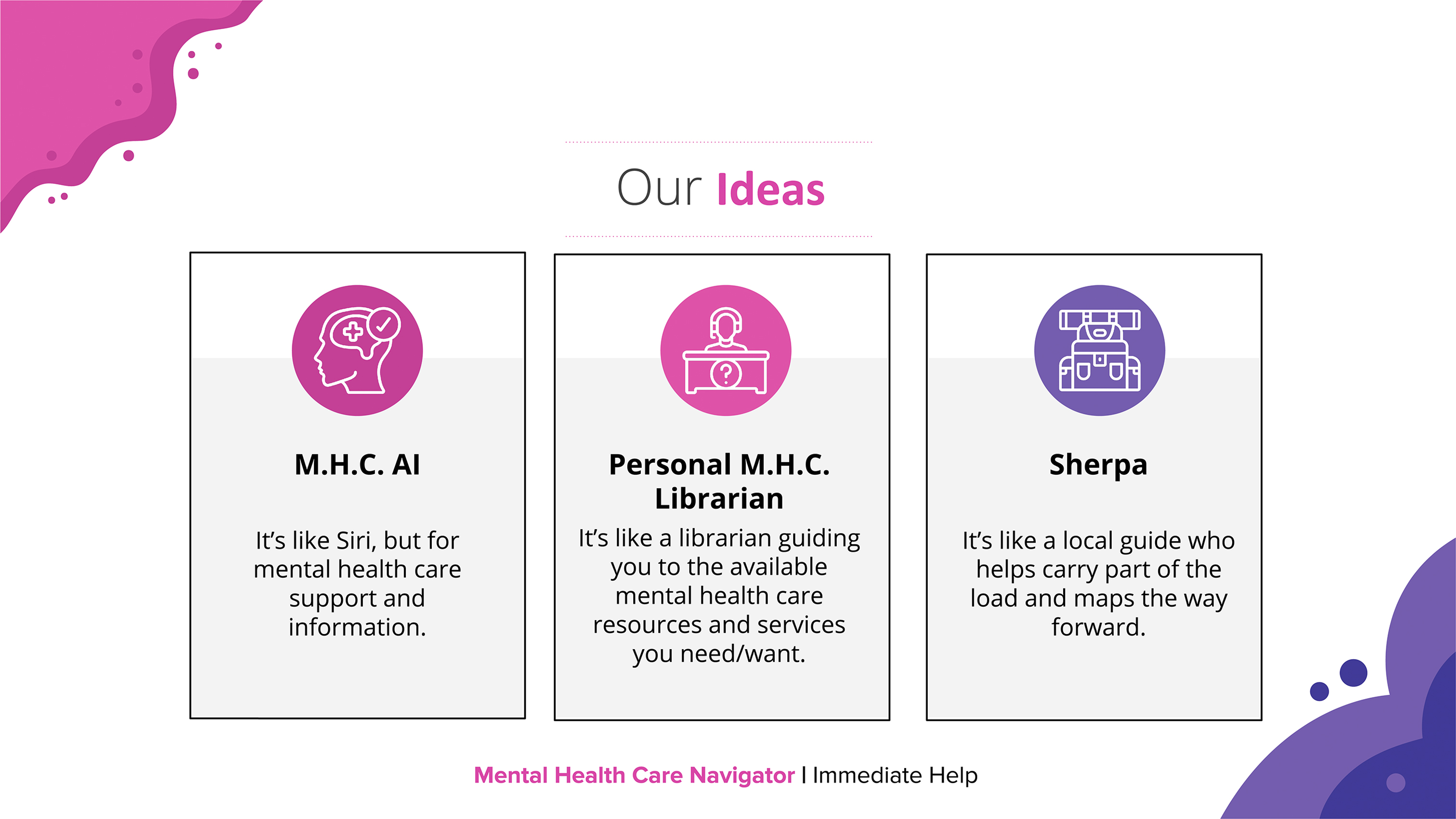
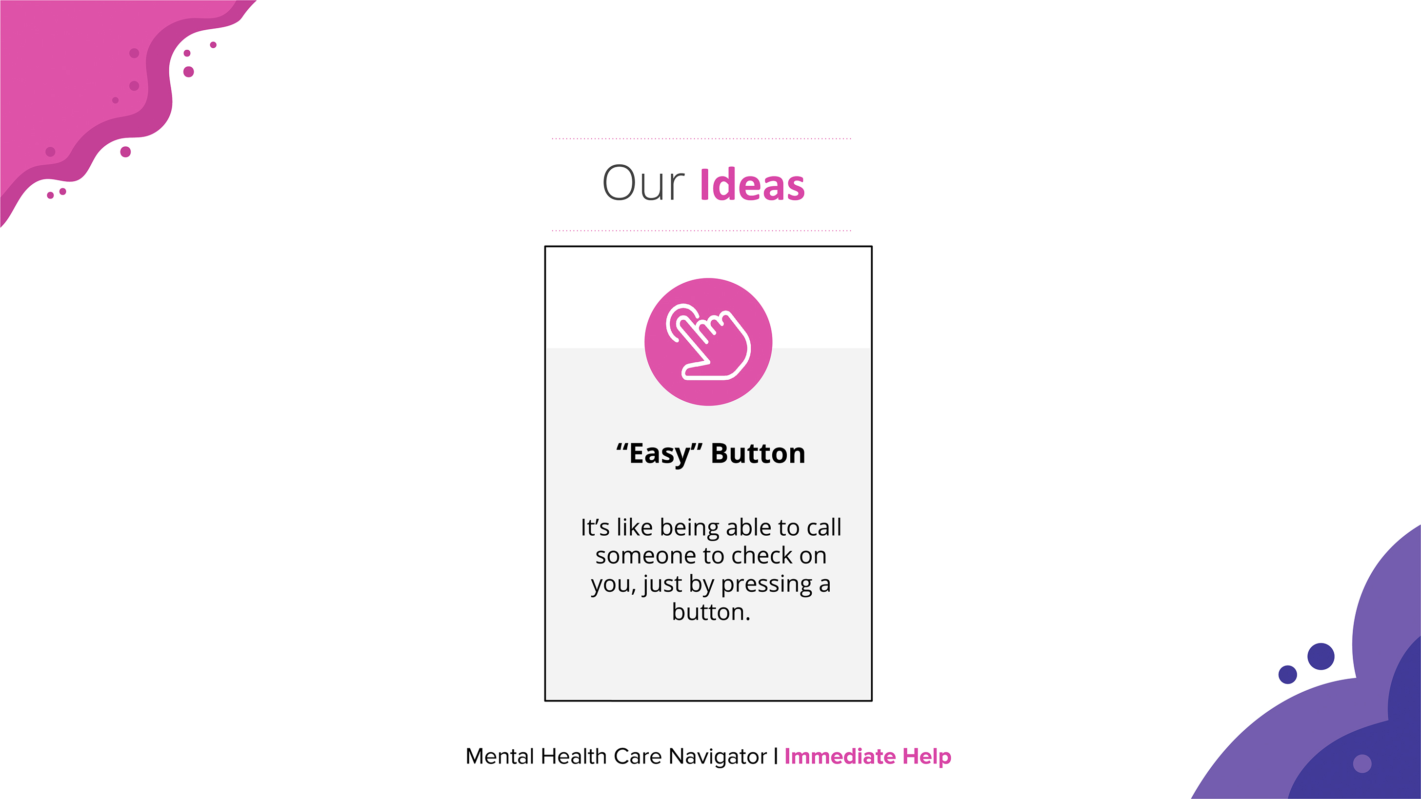
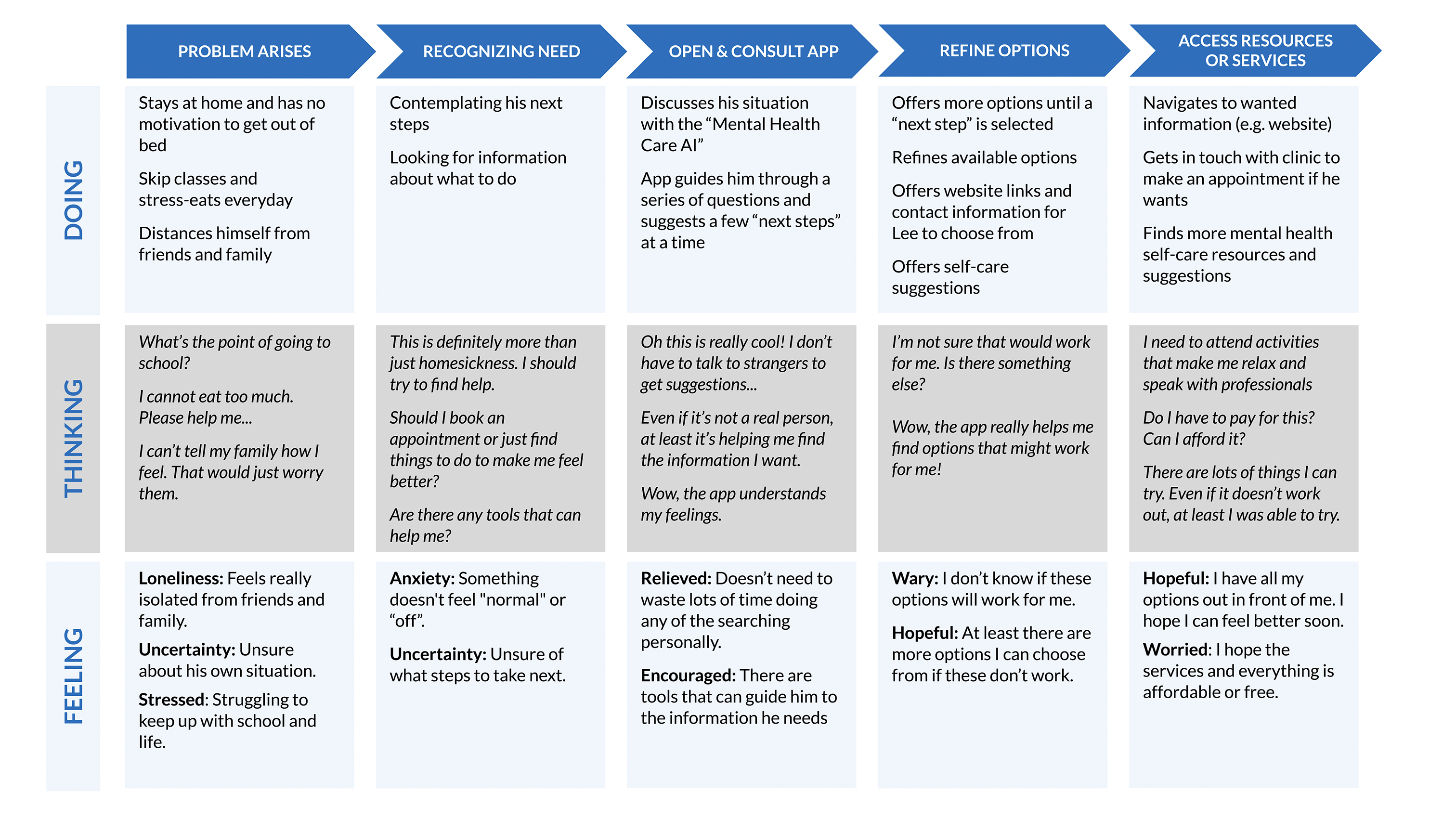
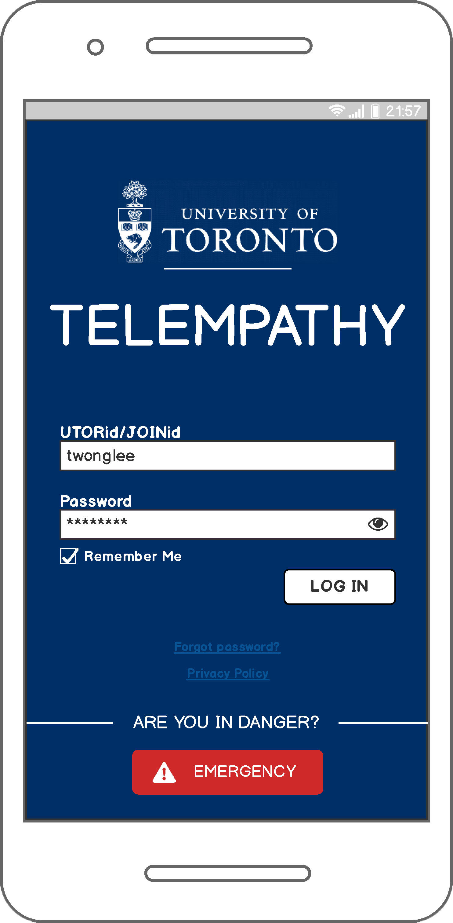
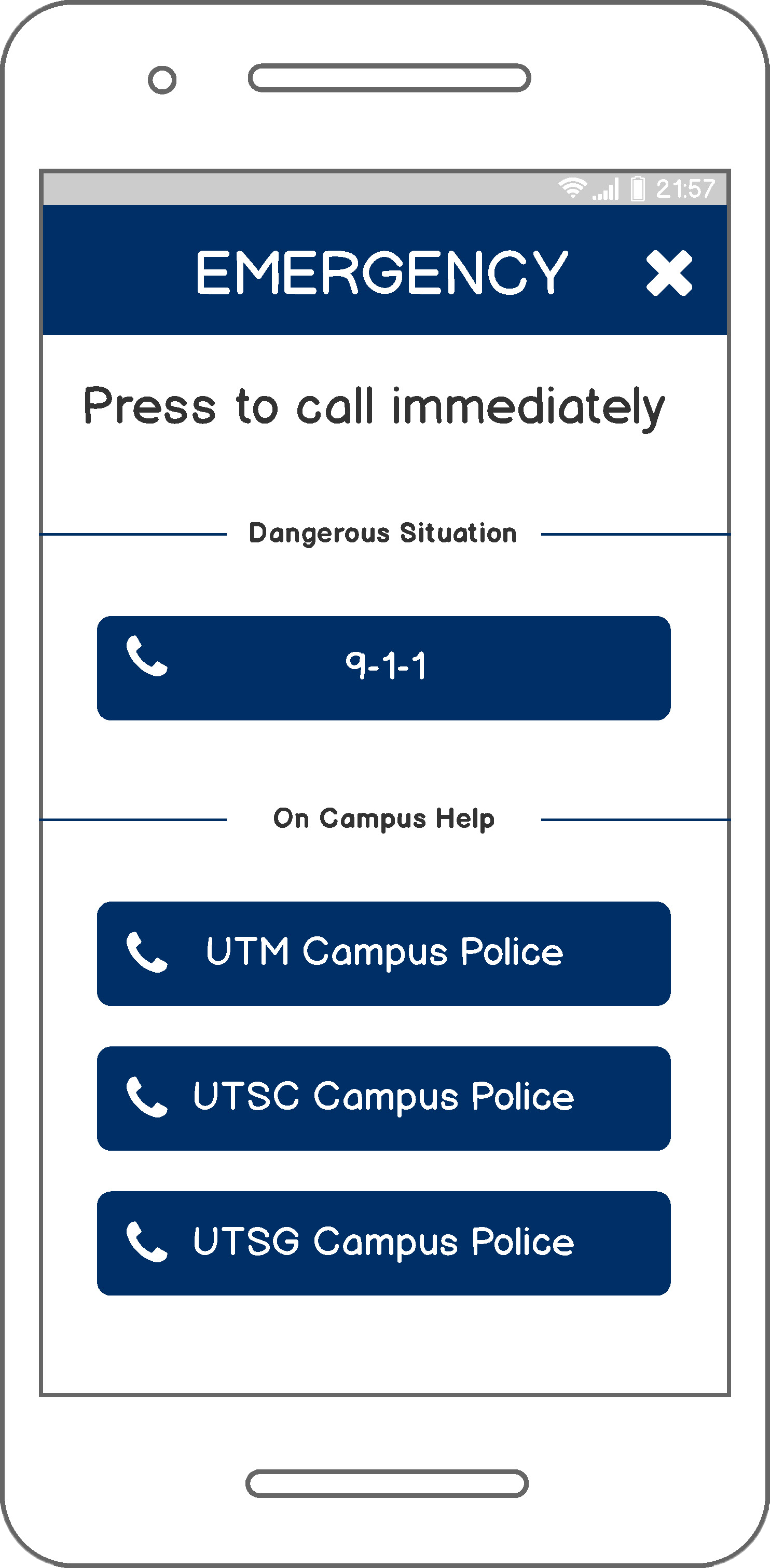
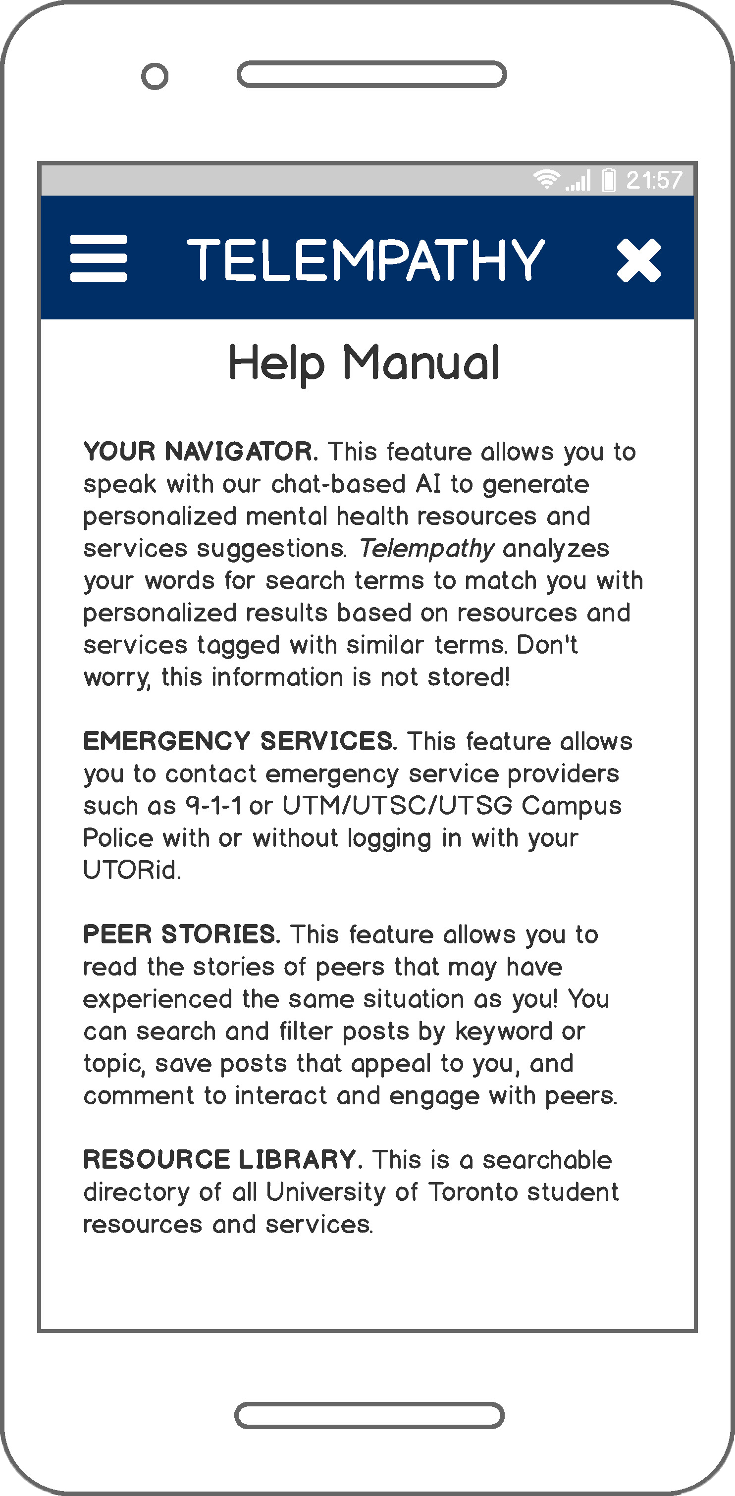
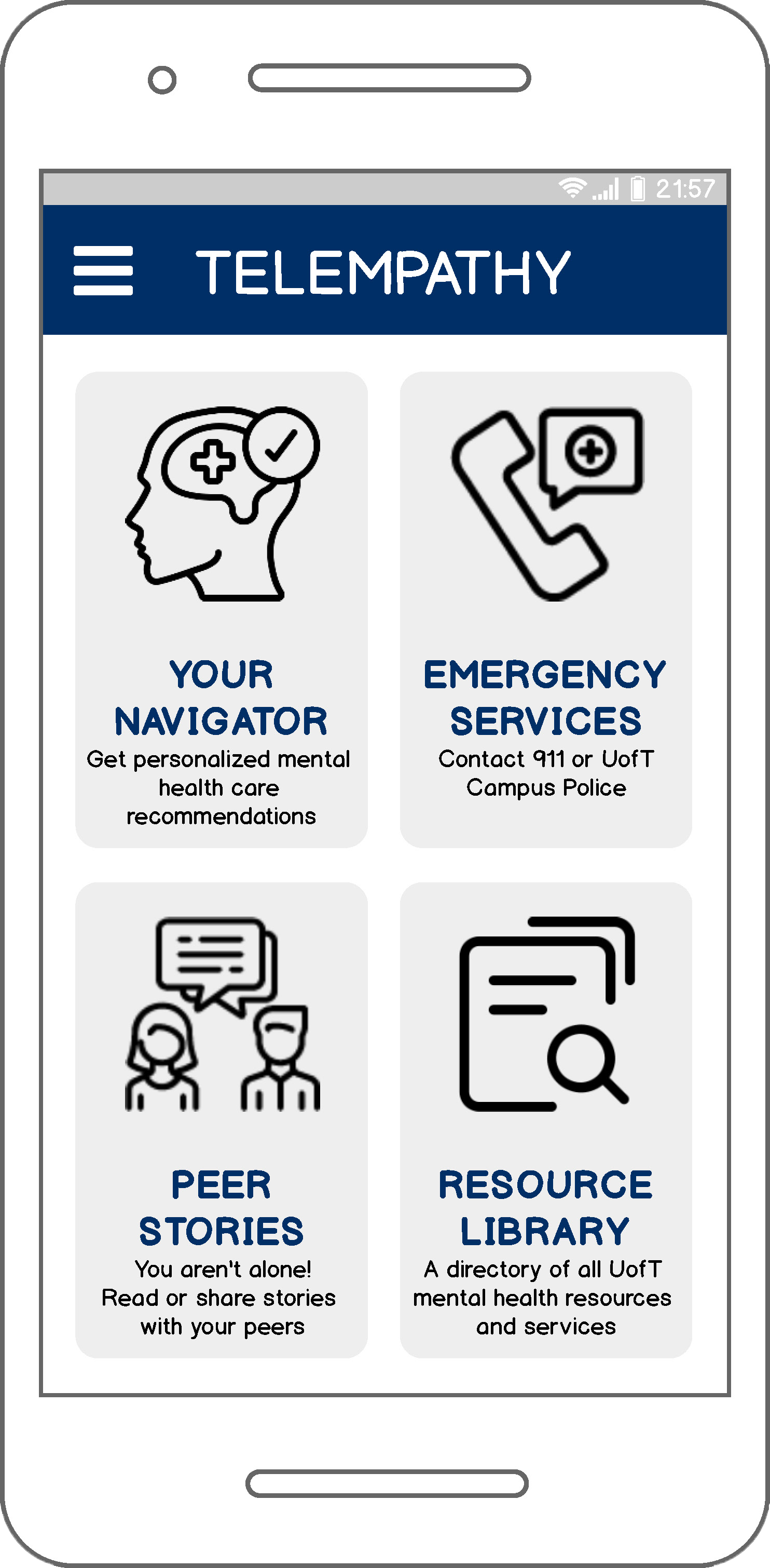
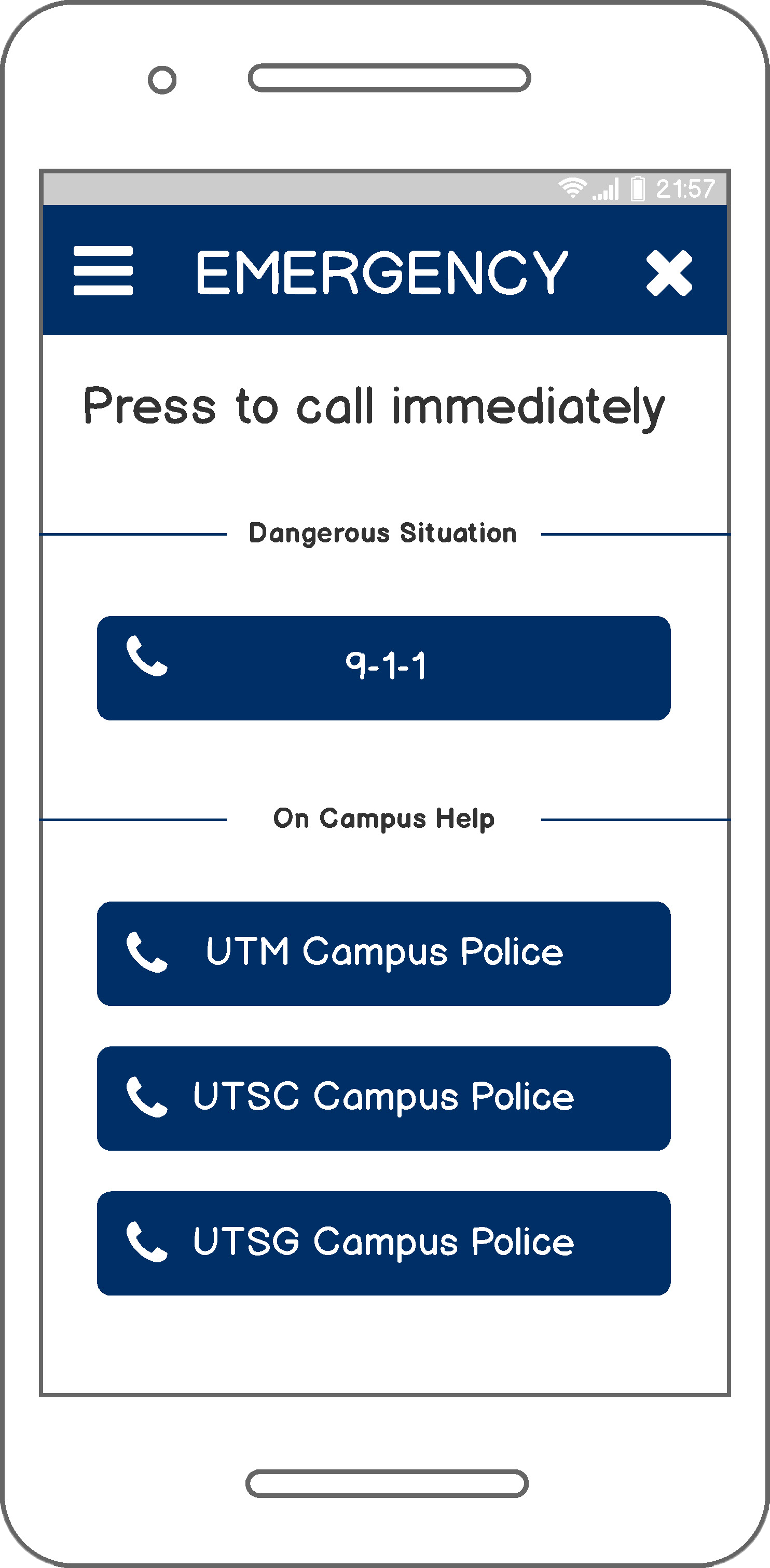
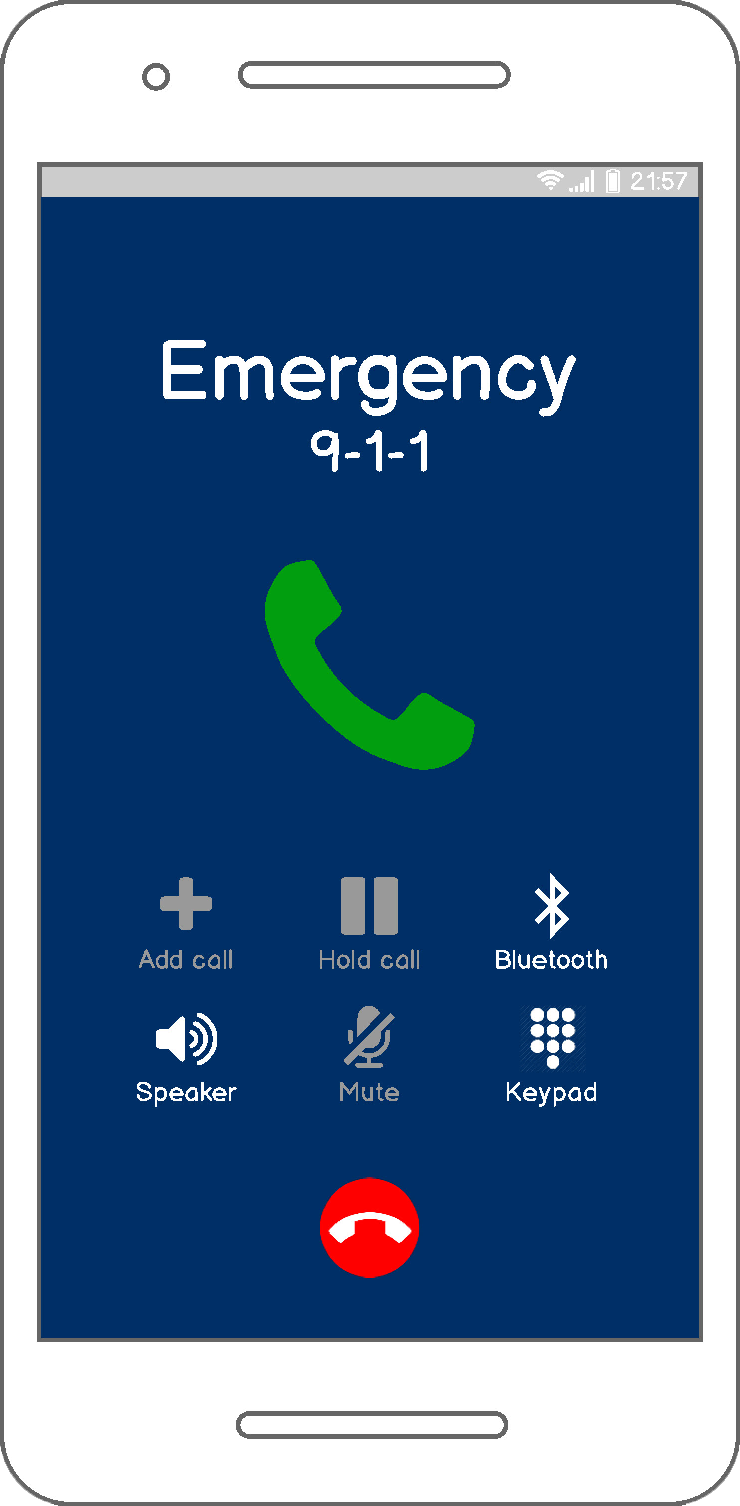
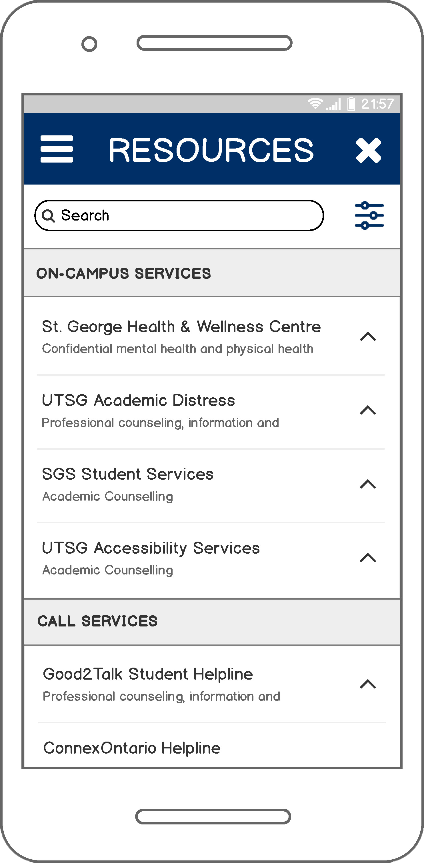
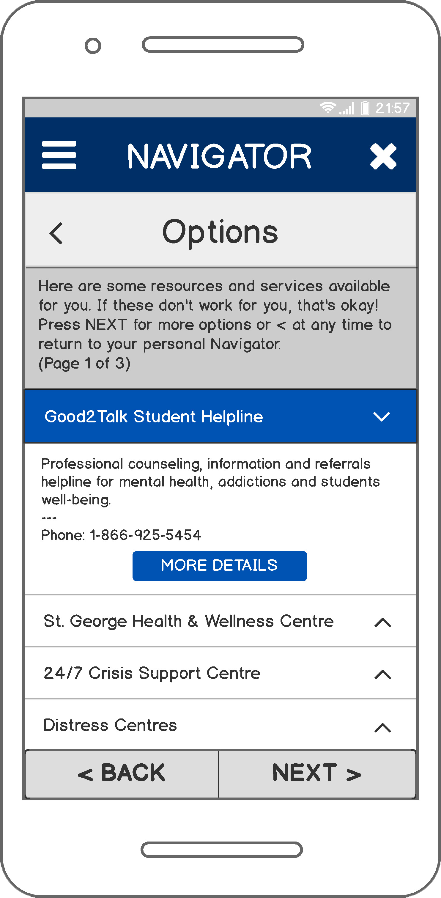
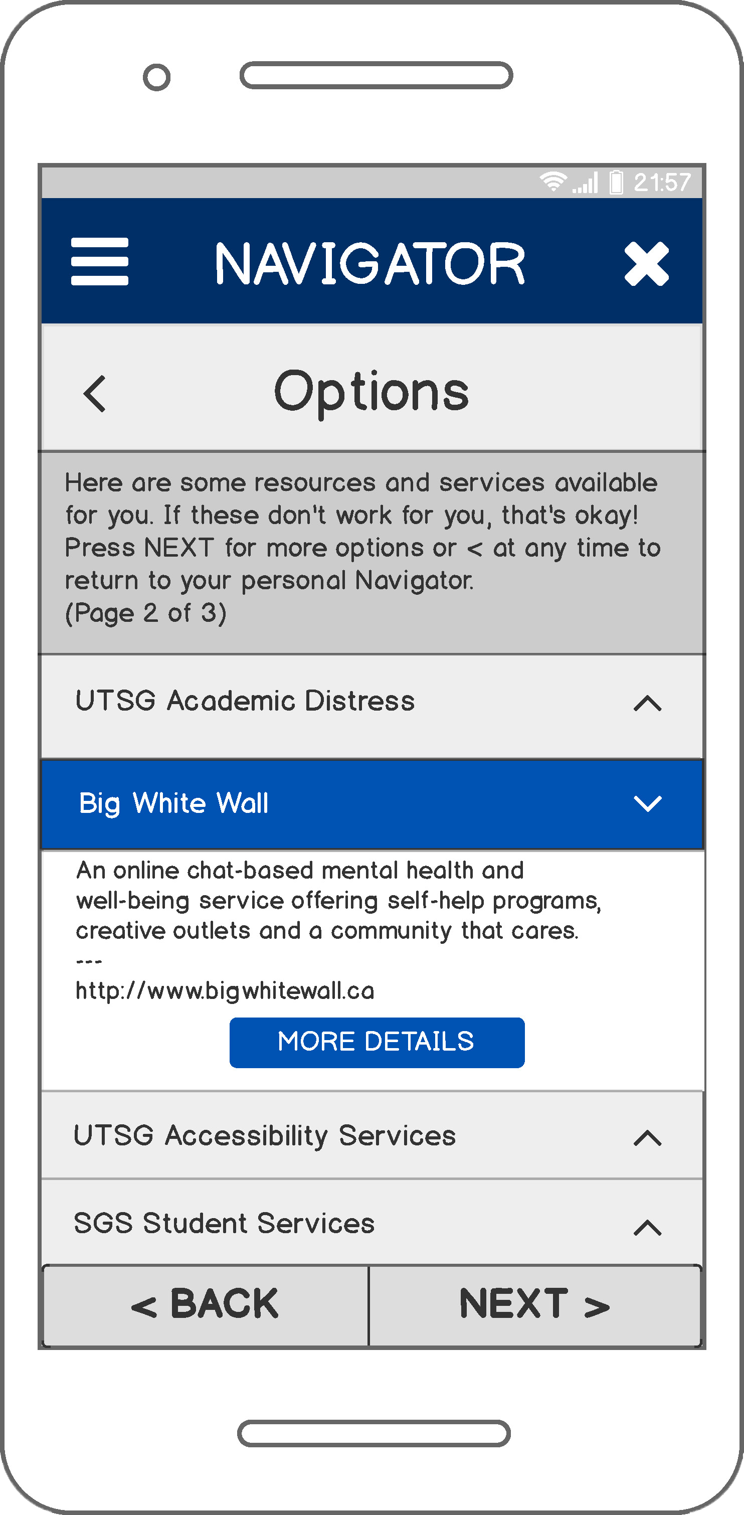
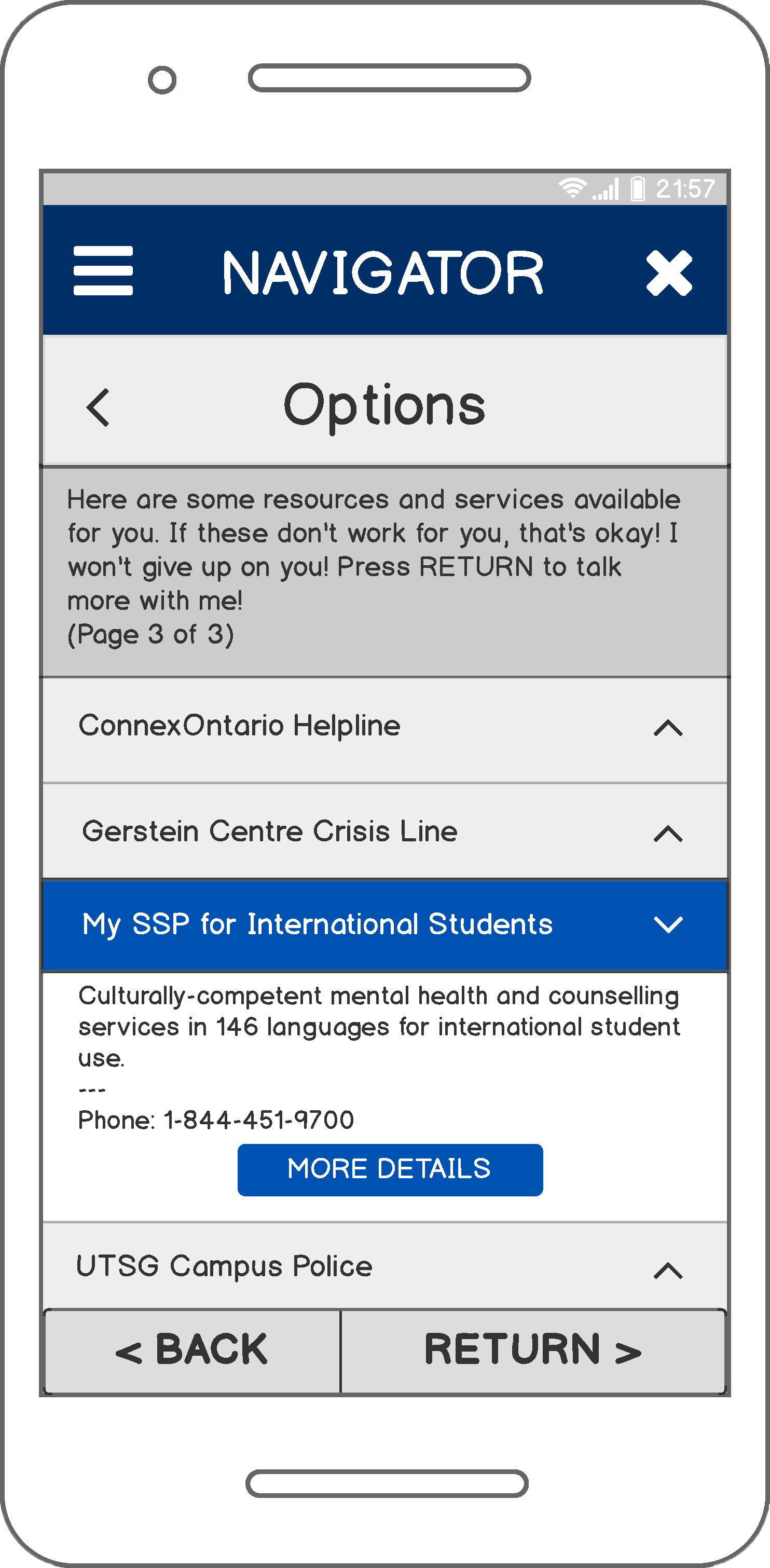
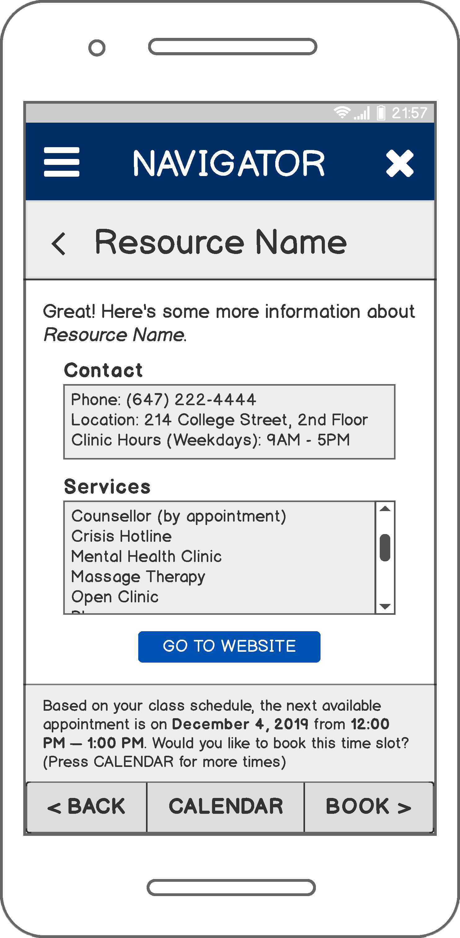
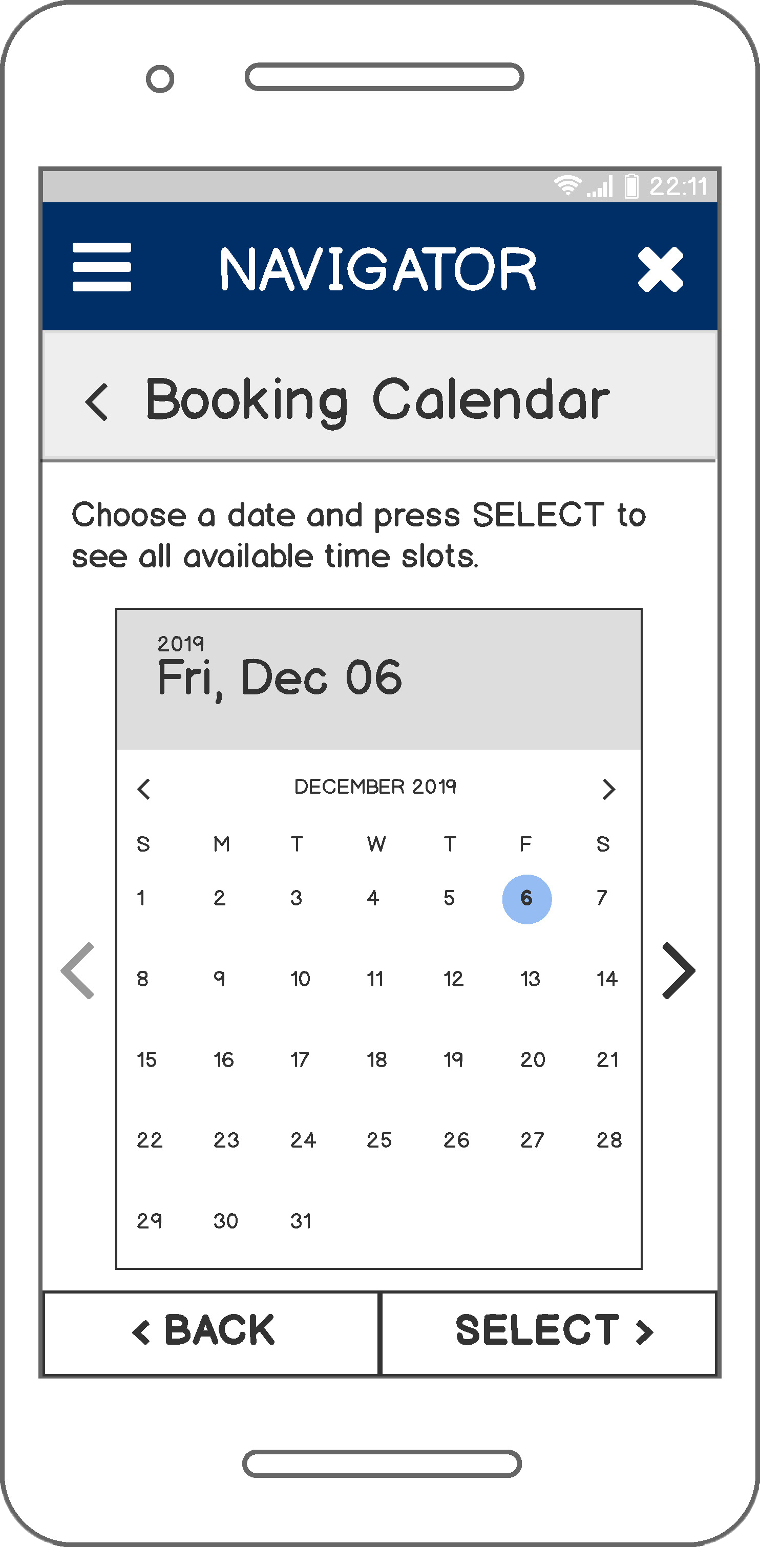
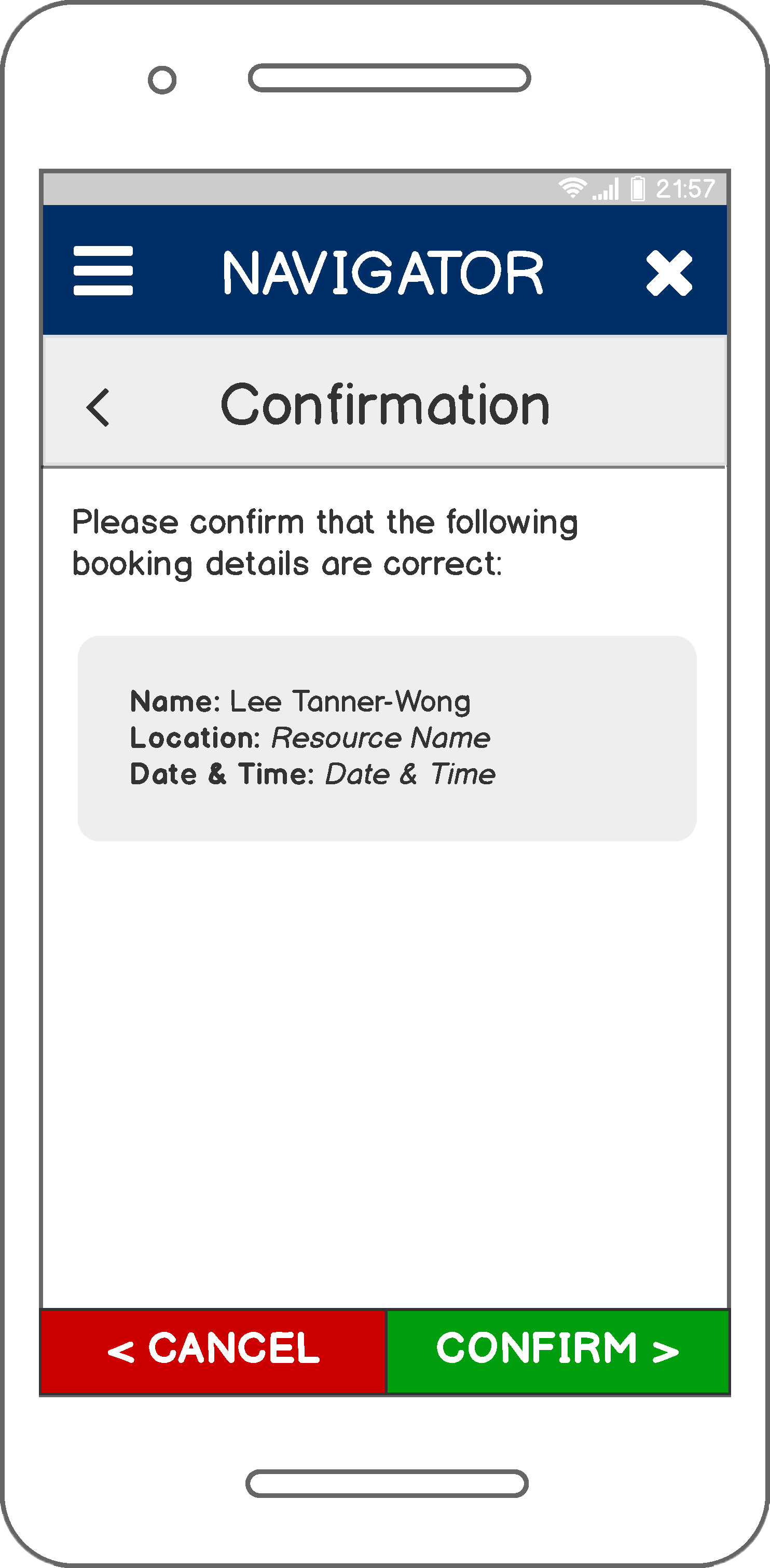
Our design team chose to develop a student-centred online platform for facilitating the access of University of Toronto students to available mental health resources and services. Telempathy makes use of the university's existing information infrastructures and frameworks to help users find and choose between a narrowed down list of options based on their preferences. Users can also book appointments through their phone, cutting out the long and arduous waitlists currently experienced by students seeking mental health services.
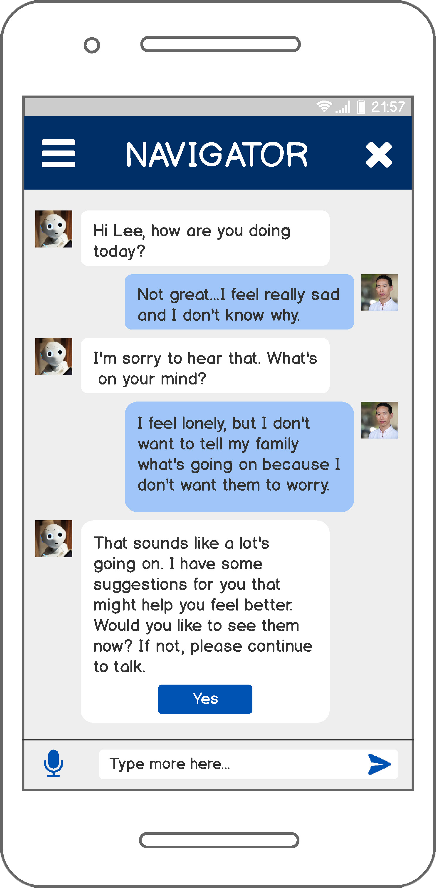
Most importantly, Telempathy acts as a mediator — a navigator, or personal librarian — between the end user and the resources and services offered by the university, guiding and enabling users to reach out for the help they may need.


.png)
.png)

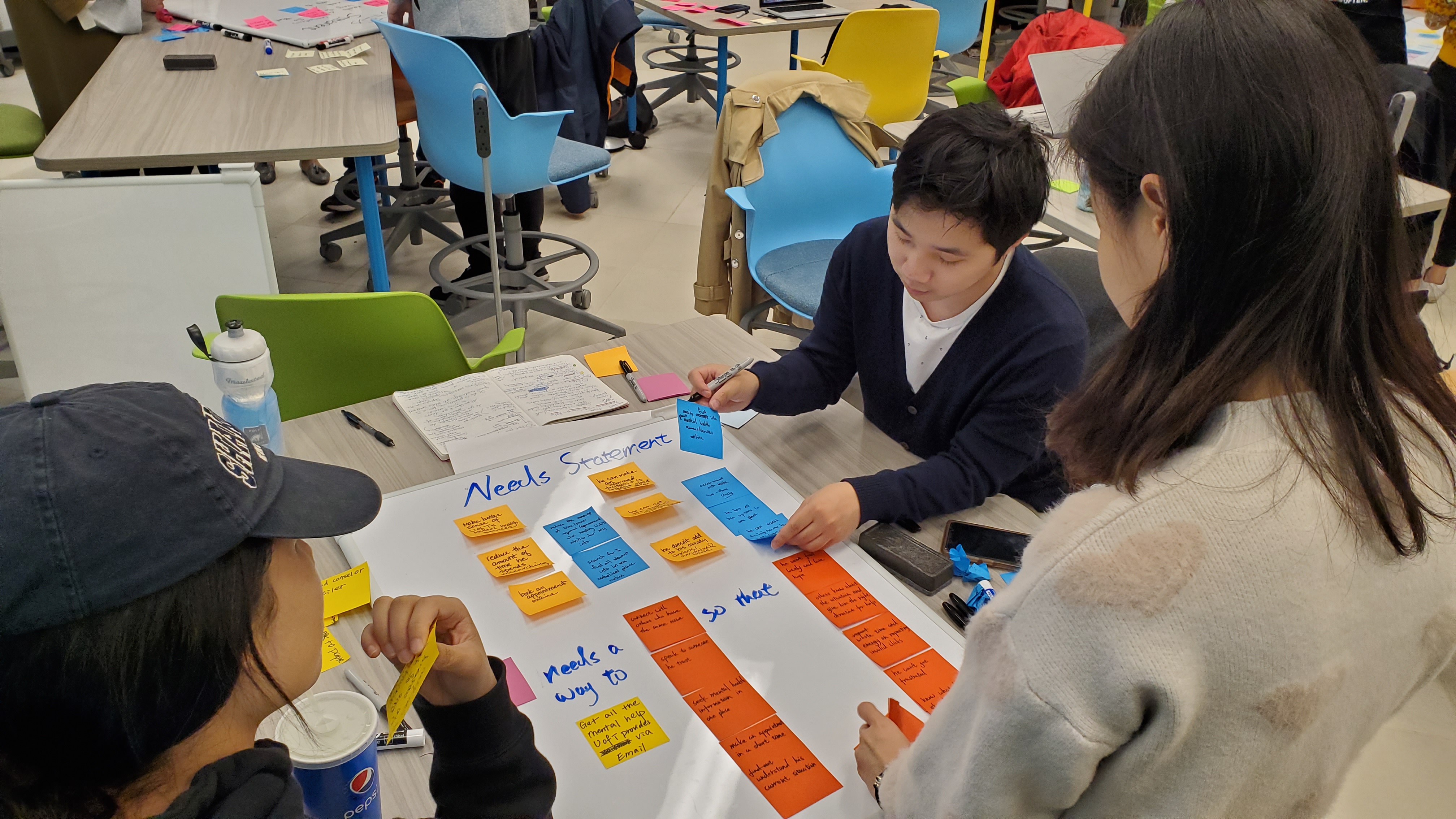
: Vicky Yao, Joshua Shum, and Ann An.")