Original navigational structure of http://www.tccld.org.

Information Architecture Redesign for CL&D

Posted 26 October 2019 by Joshua Shum

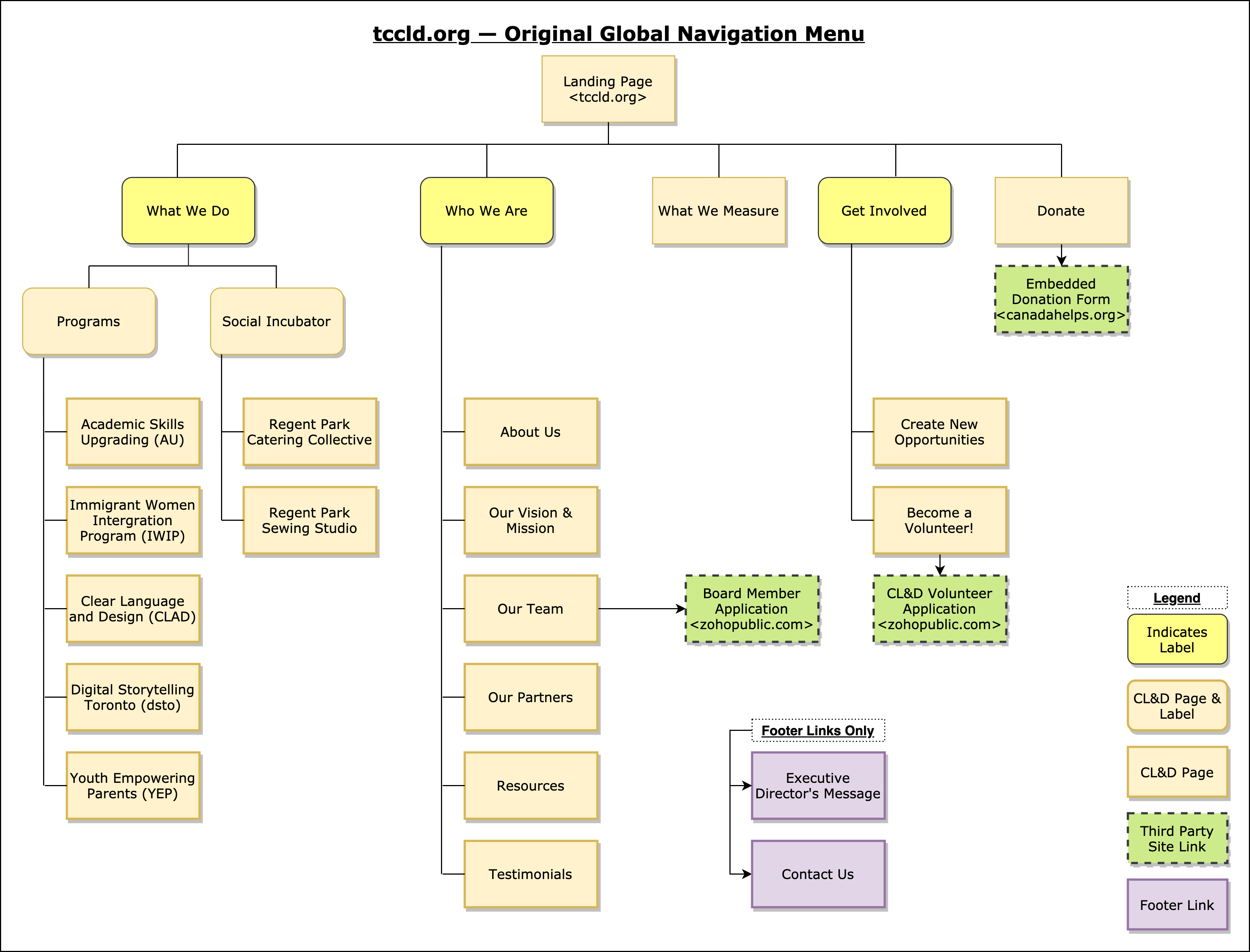
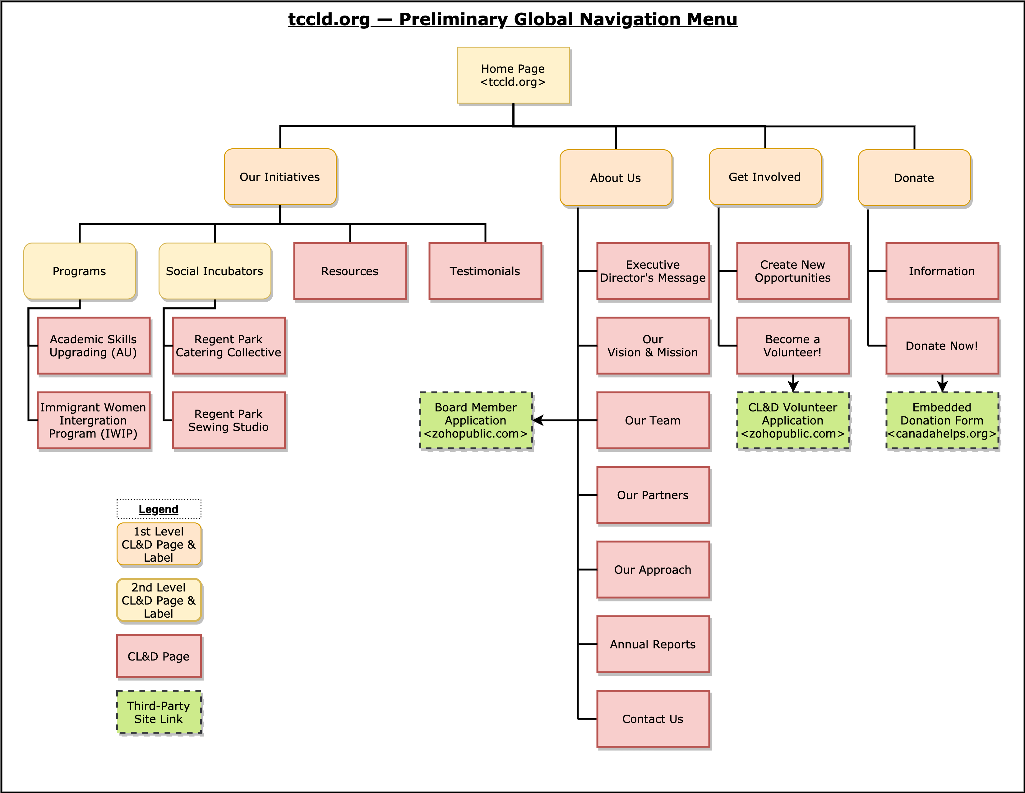
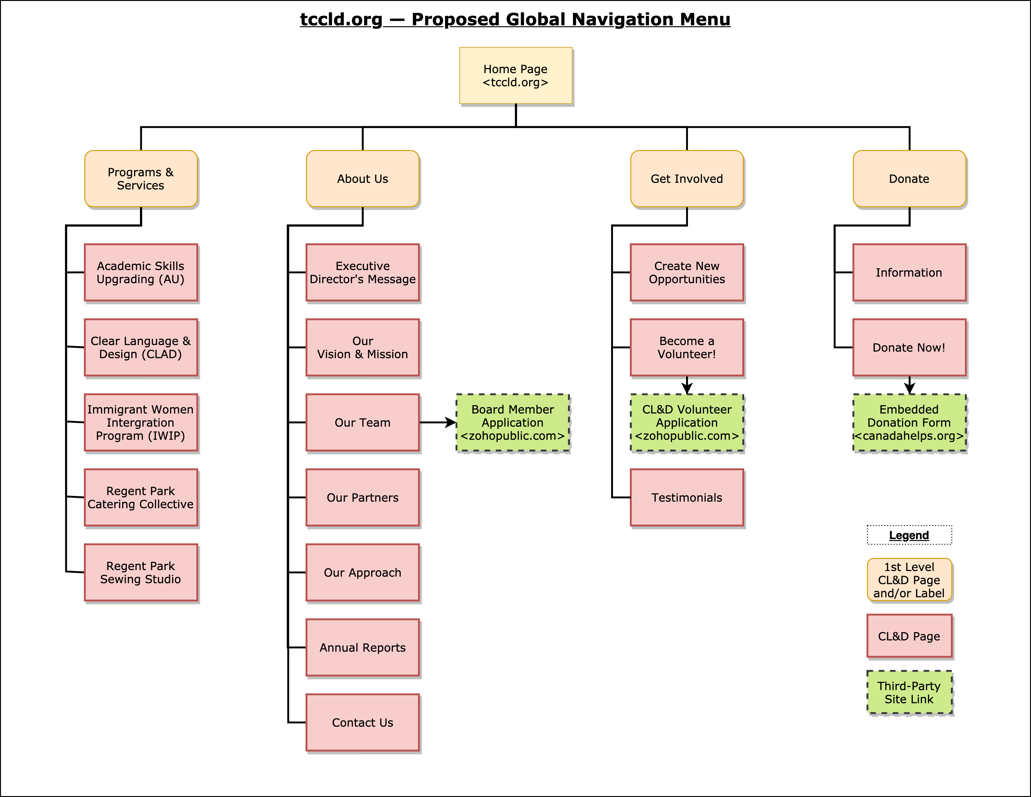
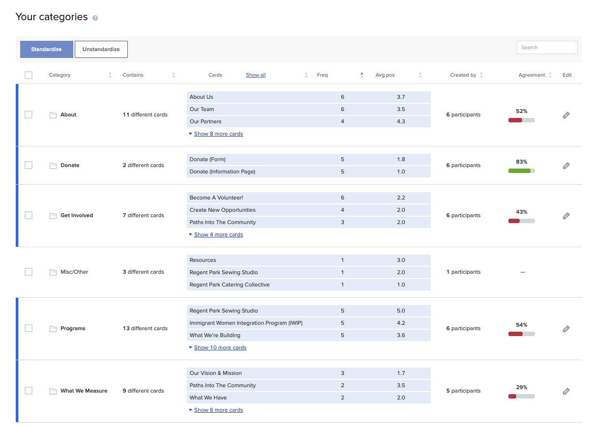
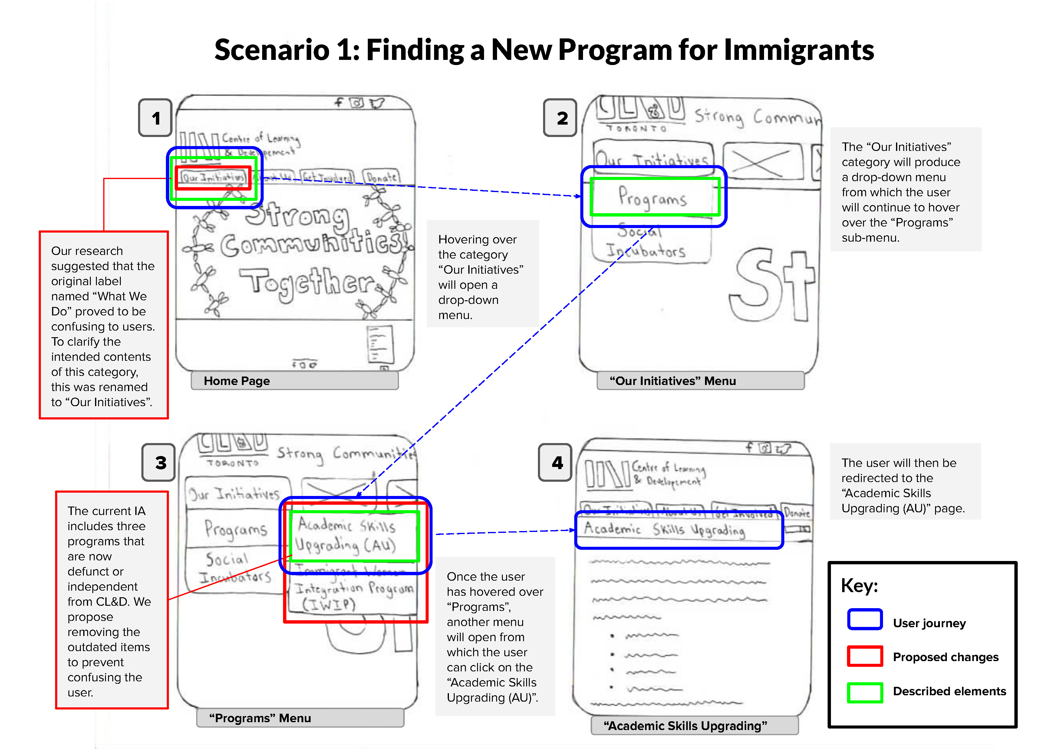
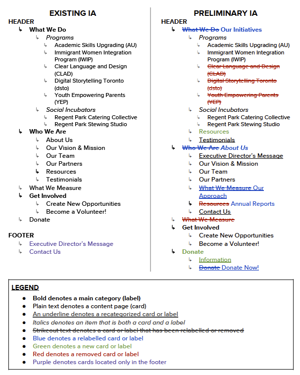
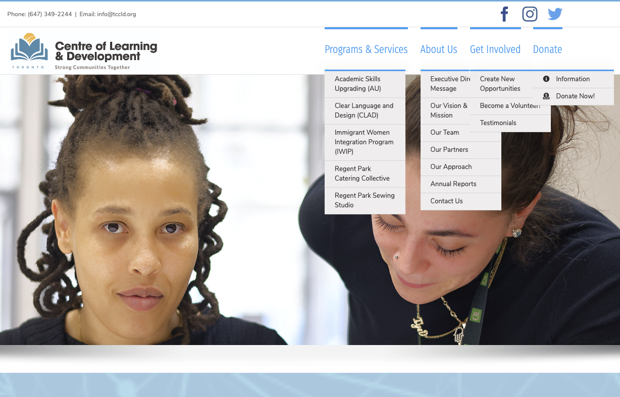
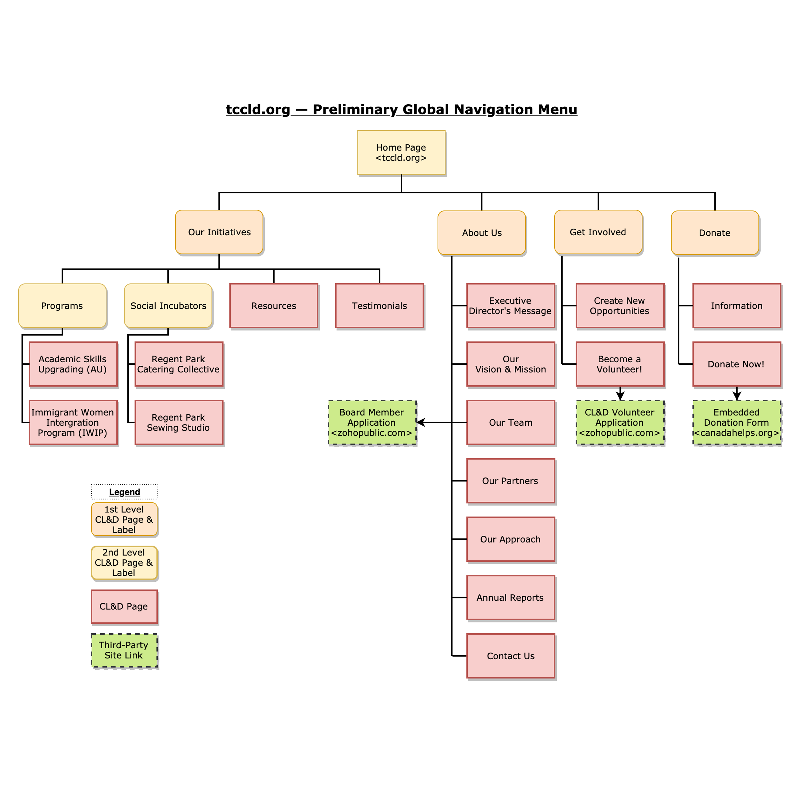
I led a team of six graduate students (including myself) in a community engagement initiative to overhaul the existing information architecture of the Centre of Learning & Development's (CL&D) website to improve the accessibility and organization of its global navigation menus (header and footer), and to address key user issues relating to information overload and insufficiency.

"Quote from CL&D"

CL&D is a local community centre located in the downtown Toronto neighbourhood of Regent Park and founded in 1979. Its mission is to build strong and healthy communities through offering training, workshops, courses, internships, and programs. According to the City of Toronto's 2016 Neighbourhood Profiles, Regent Park has a population of just under 11,000, with an above average population of visible minorities, non-native English speakers, and low-income earners.


The organization's vision is to contribute to social justice activism as advocates of change and reciprocity, and it aims to help its diverse community members to overcome issues pertaining to structural inequalities in order to promote more inclusive, participatory cultures of community engagement. To this end, CL&D has four strategic priorities:

  • Building geographic partnerships and sharing resources with areas in need
  • Building strong healthy communities through social networks and support
  • Supporting income generation through skills development
  • Addressing structural inequalities through community engagement and development

  • Project Launch

Stakeholder & Contextual Inquiry

The first step in partnering with any community organization is to establish a contextual awareness of its situation and its goals. We first conducted a stakeholder interview with the CL&D project team to elicit an understanding of the website's role to the organization, and determined five redesign objectives and requirements relating to information architecture:

  1. Improve usability & ease of website navigational elements
  2. Implement accessible & user-friendly navigation menus
  3. Reduce frequency of user errors when navigating the website
  4. Improve SEO visibility
  5. Increase findability of information pertaining to CL&D programs, projects, donations, & resources

Ethnographic Study

We then identified representative user groups through an ethnographic study of CL&D and the Regent Park community.


City of Toronto: 2016 Neighbourhood Profiles — Regent Park
Click to view full-sized 22-page PDF (Pop-up Lightbox)

Within CL&D's user base, we identified two user groups: existing stakeholders & clients and potential stakeholders & clients.

The first group includes current or former program participants, donors, board members, and volunteers, whereas the latter consists of potential program participants, donors, board members, and volunteers.


User Interviews

To elicit the needs and obstacles of users, we recruited five participants and conducted semi-structured interviews to collect qualitative data for our primary research. Three participants represented the existing stakeholders & clients group, and two participants represented the potential stakeholders & clients group.


Task-Based Usability Tests

To identify usability issues and determine user pain points, we designed a task-based usability test that was observed by an project team member. Five participants were asked to perform four tasks on the website, and encouraged to verbalize their thoughts and actions throughout the process. Each task was timed and the number of clicks required was recorded.

  • Newcomers: Imagine that you are new to Toronto. You are interested in improving your English reading and writing skills. Using the website, try to determine if CL&D can help you with this.
  • Donations: Imagine you want to find information (online) about how your donations to CL&D would be used. How would you use the website to find this information?
  • Volunteering: Imagine you have been a client of CL&D for several months. You really like the services and programs, and you'd like to apply to volunteer for the organization. How would you use the website to find out how to become a volunteer?
  • Programs: Imagine you want to find information about and join the Immigrant Women Integration Program (IWIP) on the Centre of Learning & Development website. Where can you findthis information?

These tests had high failure rates across all participants. Following the usability tests, another interview was conducted to further develop an understanding of the user experience with the website, which revealed some user frustrations (e.g. confusing website labels). In all, this suggests a problematic information architecture.


Card Sorting

To identify usability issues and determine user pain points, we designed a task-based usability test that was observed by an project team member. Five participants were asked to perform four tasks on the website, and encouraged to verbalize their thoughts and actions throughout the process. Each task was timed and the number of clicks required was recorded.

  • Newcomers: Imagine that you are new to Toronto. You are interested in improving your English reading and writing skills. Using the website, try to determine if CL&D can help you with this.
  • Donations: Imagine you want to find information (online) about how your donations to CL&D would be used. How would you use the website to find this information?
  • Volunteering: Imagine you have been a client of CL&D for several months. You really like the services and programs, and you'd like to apply to volunteer for the organization. How would you use the website to find out how to become a volunteer?
  • Programs: Imagine you want to find information about and join the Immigrant Women Integration Program (IWIP) on the Centre of Learning & Development website. Where can you find this information?

These tests had high failure rates across all participants. Following the usability tests, another interview was conducted to further develop an understanding of the user experience with the website, which revealed some user frustrations (e.g. confusing website labels). In all, this suggests a problematic information architecture.


Redesigned Information Architecture Proposal

Based on the data collected from the stakeholder interviews, user interviews, usability tests, card sorting study, and feedback from the CL&D project team, we created a new information architecture schematic diagram, seen below.


Preliminary Global Navigation Menu — http://www.tccld.org
Click image for more details (enlargens in lightbox).

We relabelled or removed three categories based on feedback from the Card Sorting Study that indicated that these were unclear to users, and further arranged the categories in the global navigational menu according to its importance to the website's goals, such that it can facilitate the information needs of the majority of users. Of the 5 pre-existing categories, only one had an agreement score above the threshold, and was retained as-is. Furthermore, we reorganized and relabelled certain items according to the mental model revealed by representative users during the card sorting activity (Preliminary IA Proposal Report, pp. 7-9).


User Scenarios & Workflows

To further illustrate the benefits of our proposed IA redesign to CL&D, we sketched the redesigned user journey for three of the usability tests with the new IA in place. This allowed us to compare and contrast the existing user experience with the redesigned experience to demonstrate the benefits of our proposal. Notably, all user information needs could now be met within four steps/clicks with the proposed structure.


City of Toronto: 2016 Neighbourhood Profiles — Regent Park
Click to view full-sized 3-page PDF (Pop-up Lightbox)

Prototyping the New IA

Based on recommendations with CL&D, we created another version of our proposed IA. Below is a text-based comparison of the original and final IAs, with changes highlighted in various colours (see legend).


Final Proposed IA Comparison
Click to view full-sized PDF (Pop-up Lightbox)

Based on this structure, we created a high-fidelity prototype: www.inf2170tccld.com (no longer active). Our next steps are to conduct tree-testing of the new IA to see if it is working as intended, or directly implement the new IA.


  • In Progress


SUMMARY & REFLECTIONS


Initially, users of CL&D's website were prone to committing navigational errors due to the site's inconsistent labels and confusing navigational structure. Through this project, my team and I were able to collect and interpret user research data through usability tests, interviews, and a hybrid card-sorting study to determine which elements of the site did not match the mental models of CL&D's user base, and create a clickable high-fidelity prototype.


With the new IA structure, CL&D's users are now able to locate programs and program resources, volunteer and donation information, and navigate the website with ease. Through this four-month long project allowed me to demonstrate my project management skills, user research, prototyping, and UI/UX design principles. Most importantly, working with a six-person team came with its own logistical challenges, which I am grateful to my team that we were able to support each other to overcome with great patience and understanding.

  • Joshua Shum: Project Manager, Lead Editor, IT/Networking Specialist, Communications, Card-Sorting Study Design Co-Lead, & High-Fidelity Prototyping Co-Lead
  • Kristin Cappuccio: Design & High-Fidelity Prototyping Co-Lead
  • Mona Farzami: User Scenarios, Workflows, Card-Sorting Study Design Co-Lead, & Low-Fidelity (Sketching and Storyboarding) Lead
  • Simon Walker: Schematic Diagram & Sitemap Design Lead
  • Kurt Grunsky: Data Coding & Analysis Lead
  • Kenneth Cummings: Usability Test Design & Observer Lead


Image Gallery